I have been using Bootstrap to design most of my client websites. For simpler ones I have used Skeleton. These frameworks are great but most of the times I use these frameworks for just one purpose - the rows and columns.
Now, my problem with them is that they are heavy. It is so because bootstrap has style defined for almost all kinds of html elements. Many times we don’t even use half of those styles. Also, for grid layout(rows and columns) they use either float or flexbox. If something is floated then it is necessary to clear it. This increases the code size a little bit.
Also, floated elements come out of the parent element wrapper and it looks weird. You will have to use clearfix to clear the float.
CSS Grids
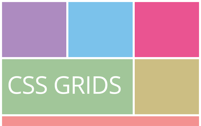
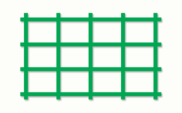
CSS Grids has been around for a long time but is not being used as much. I was astonished by its simplicity and wondered why no one ever used it in any of the frameworks. Is there one? let me know.
There are no floats and flex directions. Also, a new unit called fraction which can replace percentages.
Read: How to speed up Jekyll website
Usage
Here is a simple pen from Rachel Andrew showing how easy it is to create grids using CSS Grids.
See the Pen Grid by Example 1: Defining a Grid by rachelandrew (@rachelandrew) on CodePen.
Framework
I thought of creating a framework around CSS Grids for easy prototyping. I have designed the demo website using the same Framework.
The CSS used for Grid layout is smaller than a Kilobyte! That should make a site superfast. Here is the website - Web Grid
This is an open source project. Make use of this in your next project. Also, contribute by improving it, if you would like to.
There is one major issue - browser support. Almost all the browsers do support CSS Grids except for few mobile browsers like UC and Opera mini. I hope they will adopt this pretty soon.


