

I was fascinated when I heard about this wonderful CSS feature called CSS Grid. It was in a way an answer to all my web design issues with the current floats and flex-boxes.
And then I realized that none of the browsers support this feature yet. It is a pity that such a game changer is still taking time.
I tried designing some websites and Jekyll themes(of course) using CSS Grid layout. I had to change few things in my chrome browser to make it support CSS Grids. It was a great experience.
Here is an article to start off with CSS Grids. When you start designing your websites with CSS Grids, you will realize that you can control which element goes where without bothering about the order they are defined.
Why CSS Grid Layout?
Grid CSS is by far the best CSS out there(not yet) to divide a web page into defined regions with full control on their re-positions. Previously when we start designing a website, we had to carefully write the HTML elements in an order. After CSS Grid Layout, this will not be necessary. Order of the elements inside a Grid Layout can be changed as we wish.
This feature is what I think is the game changer. There are other wonderful features that you can look up here.
How useful is CSS Grid Layout?
CSS Grid solves a lot of existing problems. I can show you one such problem we often face in web designing. It is better to show it with an example. Consider this typical website for example.
<html>
<title>Webjeda</title>
<body>
<header></header>
<article></article>
<aside></aside>
<footer></footer>
</body>
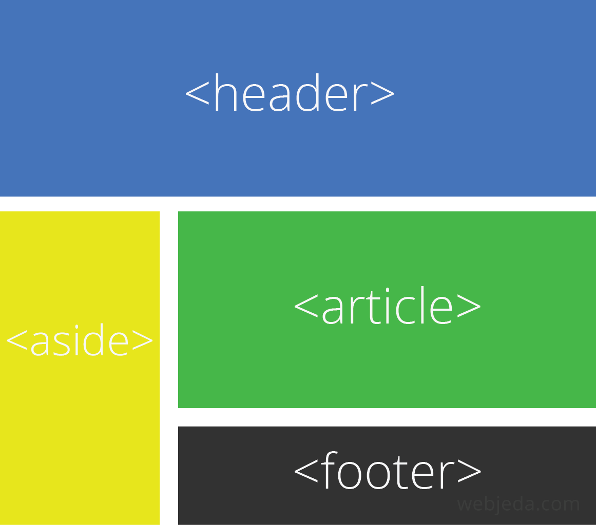
</html>Which should look like this on a desktop.
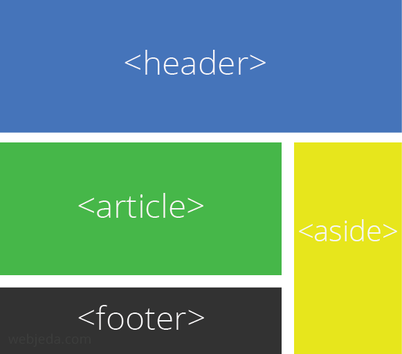
On the a laptop however, it should look like this.
Finally, on mobile devices, the site should look like this.
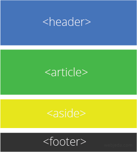
If you observe the website layout, the <aside> has changed positions in desktop, laptop, and mobile devices. If you want to implement this using float or flex-box then good luck with that. But with CSS Grid layout, it is a cakewalk.
Here is how you can do it.
  body {
      display: grid;
      grid-gap: 20px;
      grid-template-columns: 1fr 1fr 1fr; /* Dividing website into columns of 3 equal fractions */
   }

  /* For mobile devices */
  /* All direct elements of body should span across 3 fractions */

  header, aside, article, footer {
      grid-column: span 3;
      min-height: 100px;
      padding: 20px;
  }

  @media only screen and (min-width: 600px) {
      /* For laptop/tablets */

      header {
          grid-column: 1 / 4;
          grid-row: 1 / 2;
      }

      aside {
          grid-column: 3 / 4;
          grid-row: 2 / 4;
      }

      article {
          grid-column: 1 / 3;
          grid-row: 2 / 3;
      }

      footer {
          grid-column: 1 / 3;
          grid-row: 3 / 4;
      }


  }

      @media only screen and (min-width: 768px) {
          /* For desktops */

          header {
              grid-column: 1 / 4;
              grid-row: 1 / 2;
          }

          aside {
              grid-column: 1 / 2;
              grid-row: 2 / 4;
          }

          article {
              grid-column: 2 / 4;
              grid-row: 2 / 3;
          }

          footer {
              grid-column: 2 / 4;
              grid-row: 3 / 4;
          }

  }
Check out the demo here.
The demo is supported by your browser. How’s that possible?
CSS Grid Layout Polyfill
Polyfill is a code that implements a feature on web browsers that do not support the feature. There is a polyfill for CSS Grid Layout that we can use in our projects to make all the browsers support CSS Grid.
Here is the repository where you can get the code. Just use the JavaScript css-polyfills.min.js at the bottom of your project and it should work fine. I would like to thank François REMY for this awesome code. Make sure you star his repository if it helps you in any way.
This Polyfill will not work on a browser which does not run any JavaScript.
This polyfill will be redundant in the coming years when CSS Grid gets official support in all the browsers but until then we can use this and practice developing websites using Grid CSS.
Let me know if you have successfully created something using this feature.
Thanks for reading!