

Mobile First Web Design is fairly new trend in responsive web designing. Unlike covfefe, mobile first is a meaningful trend. It is just the reverse approach of what we are generally used to - Desktop First.
Web Designing is almost always done on a desktop(I’m yet to encounter someone who does it on their phone). This was the main reason why we generally design websites for desktop first and then use media queries to adapt the site for smaller devices.
- Why Mobile First Web Design?
- How to use Media Query?
- Mobile First Web Design Examples
- Advantages of Mobile First Approach
- Drawbacks of Mobile First Web Designing
- Conclusion
This approach has some drawbacks. We get a lot of screen real estate in a desktop to fit in menus, logo, header text, slider, sidebar, widgets etc., When it comes to writing media query for smaller screens, we get stuck at whether to display all those features or not.
Why Mobile First Web Design?
Mobile First Web Design is a necessity considering the sheer number of smartphone users.
Around 2 billion people are using smartphones in 2017.
A statistical analysis predicts that there will be around 3 billion smartphone users by 2020. That is a huge market. What these statistics imply is that your content on the internet should be easily consumable through smartphones.
Google has taken steps to make sure designers give importance to responsive web designing. They did it by adding website’s responsiveness as a parameter to rank on their search engine. That one step pushed many website owners to consider responsive web designing.
They want to convey that they are serious about smartphone users. A smartphone is a computer that you carry with you all the time and is always on!
Designing a website only for smartphones is actually ok because even desktop users can consume the content. Don’t you believe me? Then in Chrome, open an article on this website, hold ctrl and hit + 5 times. You will see the article exactly how it will be shown on a smartphone. It is still readable.
How to use Media Query?
Media Query is basically an if condition used by a browser to determine the screen-width. If satisfactory conditions are met, the CSS inside it will be applied.
Though it seems simple, I had a hard time using it. I needed clarifications on max-width and min-width. What are they? Why are they called so?
For the first few design projects, I never bothered finding out what they meant. Don’t do the same mistake. I have an easy way to remember what they exactly mean. I hope it will also help you remember media queries easily.
Media Query max-width
It means that if the screen width changes below max-width, then the CSS inside it will be applied.
Let’s say we have a media query like the following,
    @media only screen and (max-width: 600px)  {
            .xyz {
                background-color: blue;
            }
    }
The color changes to blue if the screen width is below 600 pixels.
I remember it this way,
1. The maximum width of the screen is 600px(Not really but it will be easier to understand this way).
2. If you decrease the width, the CSS inside media query will be applied.(when maximum width itself is 600px, you cannot increase it anymore. Can you?)
Consider the box above. It changes color when the size is decreased below 600px. If you are already reading this article on a smartphone then use landscape mode to see the green box. It also changes the content. This can be achieved using :after.
Media Query min-width
It means that if the screen width changes above the min-width then the CSS defined inside the media query will be applied.
The media query for the box above can be written like this,
    .xyz {
        background-color: blue;
    }

    @media only screen and (min-width: 600px)  {
            .xyz {
                background-color: green;
            }
    }
This will have the same effect as the one with max-width.
I remember it this way,
1. The minimum width of the screen is 600px(Not really).
2. If the screen size increases then the CSS inside media query will be applied.
I’m not sure if that is what they mean but it helps me understand the “Media Query syntax”. I used to go refer to media query articles every time I needed to implement them. Not anymore!
min-width media query is the one we will be using for Mobile First Web Design.
Refer: w3schools media query
Mobile First Web Design Examples
Here is one such design where the CSS is written for mobile devices first, then media query is written for bigger screens.
http://2017.uxlondon.com/
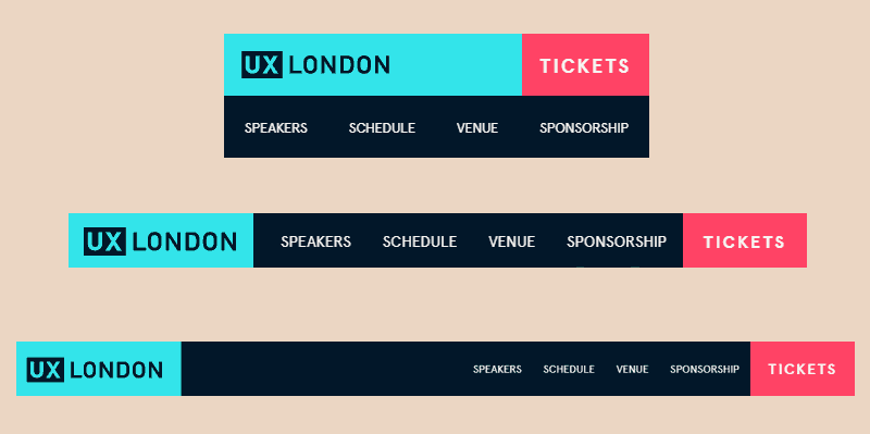
The image depicts the design flow. The header was first designed for mobile, then for tablets and finally for desktops.
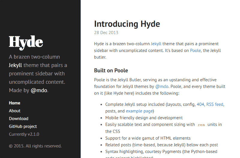
Another great example is Hyde by Mark Otto.
This is how it was designed first.
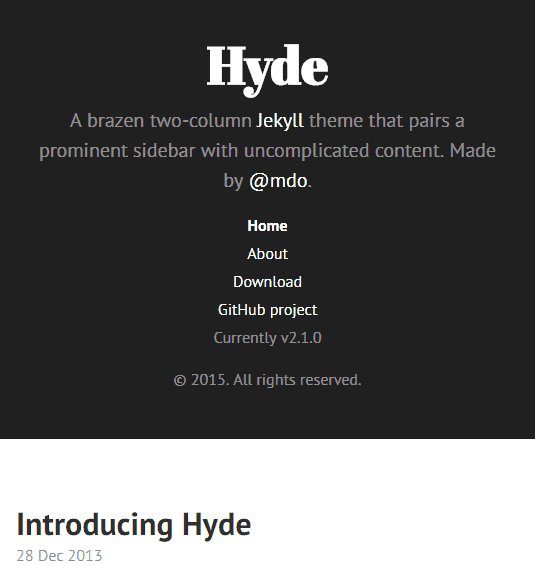
Then it was designed to adjust for bigger screens. When the screen-size increases, the header becomes the sidebar.
Now that we have seen some examples, let’s see what are some of the advantages of mobile first web designing,
Advantages of Mobile First Approach
Responsive by default
By using mobile first approach, you are designing the website suitable for almost all the devices. The main content will be accessible even if you do not have a desktop website. Check out Mobile Facebook.
By making the website responsive, you are now targeting all those 2 billion(yet to reach) users.
Better Navigation
In a desktop site it is easy to put too many menu items but when it comes to mobile site you do not have the screen real estate to do so. Mobile First approach will restrict you to use only essential menus and items on the screen. Usually, designers restrict themselves to minimal design which is good considering User Experience.

A header from Lanyon designed by Mark Otto.
Mobile First websites load faster
Mobile First websites are built from the ground up with smartphones in mind. Thus suitable, small and only essential assets are used for the mobile website. Heavy assets are loaded only for bigger screen devices. This makes a huge difference in loading speed even on a bad data connection. This is also called Progressive Enhancement.
Mobile First websites make no media query
Mobile First website - since they are built first for mobile and then for desktops - make no media query request if browsed through a smartphone. This saves some time in making the query and then applying CSS inside the query. This is not so significant but it still makes sense for bigger CSS files.
Better Design
Since the website is designed first for mobile, the design will be better than a desktop first website which is squeezed to fit inside a smaller screen. In this approach, you are most likely to place the elements carefully and consciously.
Drawbacks of Mobile First Web Designing
Even though you are using Mobile First approach, you will have to imagine the desktop site first and make your way down to smaller screens. But you have to design the mobile site first and then for tablets and finally for desktops.
It may seem like a small issue but only when you sit down to design a real website you will know the pain. I’m not sure if we can ever avoid this problem.
With majority of browsers supporting Grid CSS we can find a hassle free solution. In grid CSS, it becomes easier to place any element anywhere you want in the website.
I might sound like a hypocrite now as this website - webjeda blog - is not mobile first. I have changed the layout of the site several times. This is not the final design. I’m definitely going to implement it in the next design.
Conclusion
A decade ago there were no concerns for designing websites for hand held devices. But now looking at the technological progress, designers should be prepared to change over time. In the near future, they should be ready to build web interfaces for smart watches or Virtual Reality!