
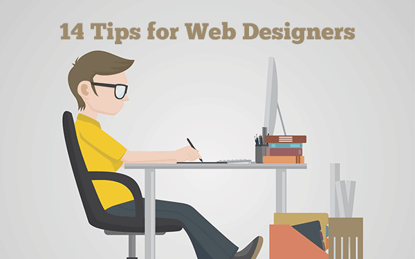
Every company purchases a domain and creates a website with the hope of showcasing their image on the web. For a company to showcase who they are and what services they provide, they must understand their brand meaning first.
After a company finds out what differentiates them from all the rest, it is time to look to expressing that in web design. There may be different ways to design a website, but the best way to design a website is to be unique.
- Color Scheme
- Logo and Favicon
- Bolds and Italics
- 2 Font Styles
- Responsive Web Design
- Custom Div Tags
- H1/H4 Tags
- Blog Section
- Pop Up Contact Form
- UI Web Design
- One Page Web Design
- Video Backgrounds
- Vibrant Colors
- White Spaces
- Quick After Design Check
A website developer must understand that he needs to create a website for a company that compliments the companies overall brand and at the same time, the website must be very user-friendly. Read below the 14 ways to customize your company website.
Color Scheme
The color scheme should be made up with 3 shades of color tones. Follow through with these color tones throughout the website. This means that every single web page should have the same color scheme. Colors create a feeling. So when selecting your 3 colors, always keep in mind what type of feeling that your company is bringing to the client.

Logo and Favicon
Make sure that a company Logo and Favicon match in color. The logo of a company will, of course, be much bigger, both with color, graphics, text, and size. A favicon should be simplified to 2 contrasting colors and have 1 small icon to represent the brand.
Bolds and Italics
When writing content on your website blog, always make sure that things that need to be bold are, and things that need to be in italics are so.
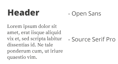
2 Font Styles
2 different font-styles is the newest trend in 2016. Use one different font style for your H Tags and another font size for all other text!
Responsive Web Design
With the vast majority using mobile devices, a web developer has no choice but to make a web design compatible for all devices. The main goal of every web developer is to provide an easy and user-friendly experience on the web page. This means, that all mobile website users must have a great experience opening up a website through a mobile device.
A responsive design will auto resize for all screen portions and this makes it easy for the regular mobile user to see the site. An easy way for a web designer to make a website responsive is doing a Media Query rule in CSS. This rule will allow the web designer to apply a certain screen size/width-height to every breakpoint of a device size.
This is one of the greatest ways and the easiest ways to make a web page responsive. Media queries are easy to understand in CSS and provide a great solution to making a webpage mobile friendly.
Custom Div Tags
Customizing the DIV tags inside a web page script will allow for cleaner code and enable you to make easy changes to your website script. To elaborate a little further, a custom div tag means to add custom names to the classes. This way, an element can be named ‘blogbox’ if it is a box that contains blogs inside. This a very neat and organized way to do things.
H1/H4 Tags
Add H1 to H4 Tags in the order of importance! This is an important step to get the perfect message out for the website visitor.
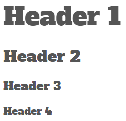
The order of importance is as its listed above, h1 the greatest and largest tag in size and the h4 is the smallest tag. The H1 Tag is known at the title tag, so the H1 tag should be relatable to website title, but have a little twist at the end.
Blog Section
Add a Jekyll blog to your website as a second directory. This will allow posts to be published out of a website and the more content relating to the domain, the better it is for SEO. The more and greater content coming out of a website, the better it ultimately is for SEO. The key to ‘quality’ content is to produce content out of a website is creating blogs that have a lot of description in them.
For example, let’s say a jeweler has opened up a website to showcase his jewelry and on his website he has a Jekyll blog. What can the jeweler write on his blog? Easy! The jeweler may publish blogs relatable to his website and give off knowledge of jewelry and the market.
By writing these type of articles, there will most likely be web page views and increased page count. This is a great example why it is very important to write blogs on your website. Writing blogs increase web page count and shows google who you are more and more!
Pop Up Contact Form
Use a POP UP contact form! A pop-up contact form provides more of a focused atmosphere for the regular web visitor to type out a message.This is one of the latest trends in web design and it is getting popular by the day.
UI Web Design
UI Interactive web designs are proven to attract the regular web visitor and keep them on a web page 3 times longer! UI Web animations tell a visual story and they have made a great improvement in web design. A website must be cautious not to speed up a UI Animation too much, keep the speed evenly equal. Another popular trend that compliments the UI Web design is Rich illustrations.
One Page Web Design
The one-page web design may have some flaws in SEO,but it is a great web design choice and on the plus side, it is the perfect mobile friendly layout. The one-page web design goes from top to bottom in a vertical motion.
The difference between the multi-page web design and the one-page web design is that the multi-page web design actually changes web pages when clicking the navigation menu. The one-page design navigates only on its page. It goes from top to bottom in a scrolling motion. For example, a person clicks on contact.
The one-page menu will auto scroll all the way down the page to the contact box. So the one-page web design scrolls within its one page instead of changing physical web pages/links.
Here is an example: Agency
Video Backgrounds
Video backgrounds are another very popular trend that makes for a great website experience. Video backgrounds are popular because they bring a certain moment of life on a web page. The only tip that a web page containing a video background must keep in mind is to watch the size of the video.
A heavyweight video can cause a website to load slowly and when a web page loads slowly the video will not open up. This will ultimately lead to a website visitor who lands on this slow loading website exit out the page before the site opens. Most website visitors are used to web pages opening at 1.5 seconds or less.
So if a website takes longer than that to open up, the visitor might leave and the website bounce rates are likely to go up the hill. Two great tips to reduce video backgrounds overall size is to decrease the frame quality and cut the video length.
Vibrant Colors
Vibrant colors are in style! Color vibrancy is somewhat like increased saturation on a photography. Vibrant colors have more color and are a bit lighter. However, one must not mix up color vibrancy with brightness. Color brightness is not easy on the eye as a vibrant color is. Adding vibrant colors to your layout will give your web page that extra spark to attract a web visitor and future client.

White Spaces
There has been a major increase in white spaces this year. White spaces have been added between elements of a web page. White spaces have promoted a cleaner website look. The extra widgets,sidebars, plugins, and other elements on a page have been removed.
The white space design not only produces a modern web design look, but it also benefits the web page by being lighter in overall size. The more elements that have been removed on the page, the lower the HTTP rate on the website, and the lighter the web page is.
Quick After Design Check
After a website has been perfectly designed, its time to put it to the test. Clean coding is one of the most important parts of a website. Websites that look great visually and have great code internally are the most valued.
Running a quick test with The W3C Markup Validation is one of the top things to do to ensure that your website script doesn’t have any errors. Even if it does, it provides the lines where the errors are located and small tips on how to fix those errors. It is best for a web page to have a minimum to 0 errors on a website script.
Use these above 14 tips to customize your web design and don’t forget to do a W3C Markup Validation after you’re done designing!
This Article is written by Andy from http://www.ntwdesigns.com/